This photograph was taken by Richard Avedon. The contrast in this photograph is very well done. The woman and her dress stick out more than the elephants. There is repitition of the shape of the woman's arms and the trunks of the elephants. A line is created by the four subjects in the photo.
Taylor's Journal
Monday, May 21, 2012
Alfred Eisenstaedt
I love this photograph taken by Alfred Eisenstaedt in 1945. It was the perfect shot to show the happiness in the sailors coming home. This photograph was not staged. I do wish his arm would not intersect with the nurse's face. This photograph has an emotion of love and happiness in it even though this couple was not together. It symbols the hardship gone through by many Americans.
Eddie Adams
I like this photograph taken by Eddie Adams in 1968. It gives a very sad emotion when I look at it. The photographer uses a long depth of field but it does not take away from the two subjects. The man's hand does not intersect with the boy at all. This showed many Americans what was happening during the Vietnam War.
Roll 14 Critique
Secondary Visual Arts Performance Task
Critique of ____________Roll 14-Cale_______________
Critique of ____________Roll 14-Cale_______________
| (Copy this organizer to take notes) Art Vocabulary and Craftsmanship | Describe the technique applied – also describe dodging and burning; depth of field, etc. There was a long depth of field used. |
|
Elements Color Line Shape Texture Form Value Space |
Analyze: specifically comment on any elements and principles used in your work. There are lines made up from the children waiting to play with the ball. The shape of the ball is shown, and it is obvious it is many different colors. There is also lines made up of the scooters in front of the children. |
|
Principles The teacher could have been more noticable and the subjects should be darker than the walls on the gym. There are patterns on the ball and the repitition of the rocks on the back wall. Proportion Variety Balance Contrast Pattern/Repetition Rhythm/Movement Unity/Harmony Emphasis |
|
| Conceptual Skill | Interpret: What is the photographer’s intent? Does it convey an idea or message? Is there a mood? the photo gives off a fun attitude. |
| Critique | Judge: evaluate the success of this piece. |
|
Other (Specify) |
|
Roll 11Critique
Secondary Visual Arts Performance Task
Critique of ____________Roll 11-Portraits_____________________________
Critique of ____________Roll 11-Portraits_____________________________
| (Copy this organizer to take notes) Art Vocabulary and Craftsmanship | Describe the technique applied – also describe dodging and burning; depth of field, etc. I just zoomed in a little on Marina, and it is a little bit of shallow depth of field. |
| Elements Color Line Shape Texture Form Value Space |
Analyze: specifically comment on any elements and principles used in your work. I like the texture of her hair with the curls. There is a nice space with her and the background and the squares on the floor. You can see the texture of her tank top and the belt around her stomach. |
| Principles The background is really light! It is kind of neat because she stands out against the background. You notice the subject, Marina, instead of everything else. The hair is emphasized, and the contrast is alright. Proportion Variety Balance Contrast Pattern/Repetition Rhythm/Movement Unity/Harmony Emphasis |
|
| Conceptual Skill | Interpret: What is the photographer’s intent? Does it convey an idea or message? Is there a mood? There is a soft mood when I look at this portrait of Marina. |
| Critique | Judge: evaluate the success of this piece. The portrait could be more interesting to look at. Maybe if there was a more interesting background, or the camera was closer to the subject's face. |
| Other (Specify) |
|
Monday, May 14, 2012
Lucia Radonchonska

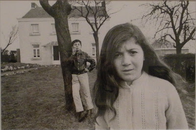
This is a random photograph by Lucia Radonchonska that I found and I really like it! There are 3 main layers in this picture. The girl, the boy, and the house behind them. The girl comes off as being annoyed at the little boy. I like how the boys arm does not intersect with the girl's hair. This photograph has a long depth of field.
Kevin Carter
Subscribe to:
Posts (Atom)


