This photograph was taken by Richard Avedon. The contrast in this photograph is very well done. The woman and her dress stick out more than the elephants. There is repitition of the shape of the woman's arms and the trunks of the elephants. A line is created by the four subjects in the photo.
Monday, May 21, 2012
Alfred Eisenstaedt
I love this photograph taken by Alfred Eisenstaedt in 1945. It was the perfect shot to show the happiness in the sailors coming home. This photograph was not staged. I do wish his arm would not intersect with the nurse's face. This photograph has an emotion of love and happiness in it even though this couple was not together. It symbols the hardship gone through by many Americans.
Eddie Adams
I like this photograph taken by Eddie Adams in 1968. It gives a very sad emotion when I look at it. The photographer uses a long depth of field but it does not take away from the two subjects. The man's hand does not intersect with the boy at all. This showed many Americans what was happening during the Vietnam War.
Roll 14 Critique
Secondary Visual Arts Performance Task
Critique of ____________Roll 14-Cale_______________
Critique of ____________Roll 14-Cale_______________
| (Copy this organizer to take notes) Art Vocabulary and Craftsmanship | Describe the technique applied – also describe dodging and burning; depth of field, etc. There was a long depth of field used. |
|
Elements Color Line Shape Texture Form Value Space |
Analyze: specifically comment on any elements and principles used in your work. There are lines made up from the children waiting to play with the ball. The shape of the ball is shown, and it is obvious it is many different colors. There is also lines made up of the scooters in front of the children. |
|
Principles The teacher could have been more noticable and the subjects should be darker than the walls on the gym. There are patterns on the ball and the repitition of the rocks on the back wall. Proportion Variety Balance Contrast Pattern/Repetition Rhythm/Movement Unity/Harmony Emphasis |
|
| Conceptual Skill | Interpret: What is the photographer’s intent? Does it convey an idea or message? Is there a mood? the photo gives off a fun attitude. |
| Critique | Judge: evaluate the success of this piece. |
|
Other (Specify) |
|
Roll 11Critique
Secondary Visual Arts Performance Task
Critique of ____________Roll 11-Portraits_____________________________
Critique of ____________Roll 11-Portraits_____________________________
| (Copy this organizer to take notes) Art Vocabulary and Craftsmanship | Describe the technique applied – also describe dodging and burning; depth of field, etc. I just zoomed in a little on Marina, and it is a little bit of shallow depth of field. |
| Elements Color Line Shape Texture Form Value Space |
Analyze: specifically comment on any elements and principles used in your work. I like the texture of her hair with the curls. There is a nice space with her and the background and the squares on the floor. You can see the texture of her tank top and the belt around her stomach. |
| Principles The background is really light! It is kind of neat because she stands out against the background. You notice the subject, Marina, instead of everything else. The hair is emphasized, and the contrast is alright. Proportion Variety Balance Contrast Pattern/Repetition Rhythm/Movement Unity/Harmony Emphasis |
|
| Conceptual Skill | Interpret: What is the photographer’s intent? Does it convey an idea or message? Is there a mood? There is a soft mood when I look at this portrait of Marina. |
| Critique | Judge: evaluate the success of this piece. The portrait could be more interesting to look at. Maybe if there was a more interesting background, or the camera was closer to the subject's face. |
| Other (Specify) |
|
Monday, May 14, 2012
Lucia Radonchonska
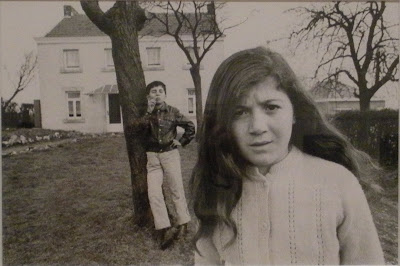
This is a random photograph by Lucia Radonchonska that I found and I really like it! There are 3 main layers in this picture. The girl, the boy, and the house behind them. The girl comes off as being annoyed at the little boy. I like how the boys arm does not intersect with the girl's hair. This photograph has a long depth of field.
Kevin Carter
Dorothea Lange
This is a well known photograph, but I still enjoy looking at it. It gives off a very sad emotion of depression. The photograph shows rule of thirds because the mom's head is in the middle, and the two boys' heads are in the right and left corners.The photo shows a short depth of field because the background is blurry.
Steve McCurry
I like this photograph by Steve Mccurry because of the colors. The boys shoulders are below the skys horizon and above the grass line. All you can see is his silouette, which makes the colors stand out.
Ansel Adams
I enjoy looking at this photo by Ansel Adams. I like the bright lines of the river. The light coming from the sky is very appealing to look at. The contrast is very well done. The darks are dark and the lights are bright.
Thursday, May 3, 2012
Carters Mountain: Roll 12
Secondary Visual Arts Performance Task
Critique of _________Carters Mountain: Roll 12_____________________________
Critique of _________Carters Mountain: Roll 12_____________________________
| (Copy this organizer to take notes) Art Vocabulary and Craftsmanship | Describe the technique applied – also describe dodging and burning; depth of field, etc. I used a shallow depth of field since the apples in the distance are not in focus. |
|
Elements Color Line Shape Texture Form Value Space |
Analyze: specifically comment on any elements and principles used in your work. I got close to the subject to show the texture(the dots in the apple). There are repeated shapes of circles and curved lines. |
|
Principles The contrast between the apples and the dark background makes them stand out.Proportion Variety Balance Contrast Pattern/Repetition Rhythm/Movement Unity/Harmony Emphasis |
|
| Conceptual Skill | Interpret: What is the photographer’s intent? Does it convey an idea or message? Is there a mood? When I look at this, I feel the mood of fall, when it is apple picking season:) |
| Critique | Judge: evaluate the success of this piece. I enjoy looking at this picture. Maybe if there were more apples, it would improve the picture? |
|
Other (Specify) ? |
|
Spring Break: roll 9
Secondary Visual Arts Performance Task
Critique of _______________Spring Break: Roll 9__________________________
| (Copy this organizer to take notes) Art Vocabulary and Craftsmanship | Describe the technique applied – also describe dodging and burning; depth of field, etc. I used a slow shutter speed since the subject is a motion blur. |
| Elements Color Line Shape Texture Form Value Space |
Analyze: specifically comment on any elements and principles used in your work. I did not use space very well because the jump interferes with the ponies head. The form of the rider and the pony is perfect. It is at the point of the jump where the pony is well rounded and had just left the ground. |
| Principles You can tell that there is movement in the photo due to the blur. The contrast is not very good, the picture is too gray in my opinion.Proportion Variety Balance Contrast Pattern/Repetition Rhythm/Movement Unity/Harmony Emphasis |
|
| Conceptual Skill | Interpret: What is the photographer’s intent? Does it convey an idea or message? Is there a mood? To capture the rider in the middle of her course. |
| Critique | Judge: evaluate the success of this piece. I would have liked the picture to be focused and I would have liked to seen the ponies head. The rider and the ponies position is awesome though. |
| Other (Specify) ? |
|
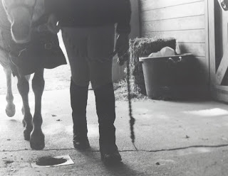
Hands and Feet- Roll 8 (Sommer and Rita)
Secondary Visual Arts Performance Task
Critique of ________Hands and Feet: Roll 8_________________________________
Critique of ________Hands and Feet: Roll 8_________________________________
| (Copy this organizer to take notes) Art Vocabulary and Craftsmanship | Describe the technique applied – also describe dodging and burning; depth of field, etc. I had a long depth of field since everything is in focus. |
|
Elements Color Line Shape Texture Form Value Space |
Analyze: specifically comment on any elements and principles used in your work. I liked the space between the lead rope, and how it did not intersect with the bale of hay. |
|
Principles The legs of both the pony and the rider are in contrast with the floor as the light comes into the barn. Proportion Variety Balance Contrast Pattern/Repetition Rhythm/Movement Unity/Harmony Emphasis |
|
| Conceptual Skill | Interpret: What is the photographer’s intent? Does it convey an idea or message? Is there a mood? Its shows a little girl walking her pony. I feel as if there is no mood. This picture was not as well taken as it could have been. |
| Critique | Judge: evaluate the success of this piece. I should have been lower to the ground and maybe closer. To me, this is a little boring to look at. |
|
Other (Specify) ? |
|
Friday, March 30, 2012
Assignment 2
I would love to just take a couple weekends off and go to horse shows to shoot rolls of film. I would use a large aperture to geth a shallow depth of field. With a shallow depth of field I would take pictures of the horses head, the bridle, a close up of the riders leg and saddle, the stirrup iron, and maybe just the horse's nose. I would also use a very fast shutter speed to take many pictures of the horses jumping. I would have to use a very fast shutter speed to get a nice sharp photo.
Wednesday, March 28, 2012
DVD Assignment 2
I think Jim limited himself to only one photograph a day to give himself a challenge. This kind of set the bar high, and he knew he had to get the perfect shot the first time on each day. There was no second shot, until the next day. Each day, he would have to find one idea for a picture and wait. He needed to wait for the perfect shot. Having multiple shots each day could result in many pictures that were random and not all interesting.
DVD Assignment 1
I enjoyed Jim's image of the frozen flower. He had a short depth of field, so my eye went straight to the flower. This picture had great detail. What I noticed most was the frost on the flower. I could see every strand of frost frozen on the pedals. The whites of the flower were also very bright.
Monday, March 26, 2012
Assignment 5
I enjoy looking at this picture because of the wave of water from the skis. The sun is setting in the background, which is giving off an orange tint, which is so pretty! I like the angle of the skiier, and how close he is to the water below him. In the wave, you can also see the reflection of the sun, which is neat.
Assignment 4
My house is with the two black jeeps in the driveway, with lots of bushes behind them. There is a big gold truck parked in the street, and that is Remington's truck. Almost everyday his truck is parked there. There is a frowning face next to my neighbors house because we don't really care too much for her. She gets mad at Remington when he parks on the street, because she says it is too hard for her to pull into her driveway. There is always one kid skateboarding in the middle of the road when I am trying to drive down it.
Assignment 11
I think that this building is very pretty, but to look at the picture, it is kind of boring. I could have gotten closer to the colomns. The window in the upper left corner can be distracting, and could be taken out. The bushes could also be taken out because they can also take away from the colomns.
Tuesday, March 20, 2012
Assignment 10
 I chose this picture of lines because I love fields in general. The photograph gives a dark mood because of the dark grass and the low dark clouds. I love the lines pattern in the grass, as if it had just been mowed.
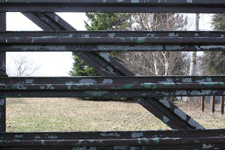
 I chose this picture of the gate because I like photographs of old rustic gates. I like how the gate has 4 rows of lines, and the tree, the fence, and the grass are all part of the back ground behind the gate. The more I look at it, it is like I am peeking through the gate to look to the other side.
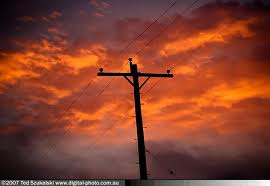
 I like this picture of the sky because the light pinks and the bright orange go great together, and it is a nice sunset. The silouette of the power line is great because it is so dark in front of the sky, and this makes it stand out.
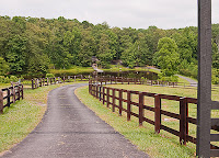
I enjoy looking at this picture because I feel as if I am driving or walking down a driveway leading to a barn or some farm land. The fence adds great detail to the driveway and it leads your eyes down, and then they curve to the right.
Assignment 9
I like my photograph of long depth of field. I like how the camera was tilted to create diagonal lines. I like the curves on the back of the bench also. If I could improve this picture, I would move to the right a little bit to get more of the railing in the picture.
Thursday, February 23, 2012
Assignment 8
This photograph of a room shows long depth of field because everything is focused in the picture. The photograph also shows a great amount of lines and shadows. The photographer used a small aperture because the whole picture is focused and it makes your eyes look far into the picture.
Assignment 8
This photograph of a railroad was taken with a small aperture because it shows a long depth of field. The photographer could have been up close or laying down on the tracks to get the effect of forever ending lines.
Assignment 8
This photograph shows a short depth of field. The fence is close up and focused, and the barn is not focused in the background. The photographer used a large aperture since the barn is unfocused in the background. The photographer was up close to the fence, making the rest of the fence and the barn not focused.
Friday, February 17, 2012
Assignment 8
This picture of a jockey's saddle shows a short depth of field. The saddle is very focused, and the people in the background are not very focused and blurry. The photographer was close up to the saddle, and used a large aperture, allowing the saddle to be the main focus.
Assignment 8
This photograph of a horse's nose shows a short depth of field. When an audience looks at this picture, the first thing noticed is the nose. The background is very shallow. A large aperture was used in the process of taking this photo.
Assignment 8
I love this photo that shows a long depth of field. The photographer is far away, which makes a long depth of field. A small aperture was used while taking this photo.
Assignment 7-motion blur
I love Dakota's ears flopping all over the place while he is running! The ears are my favorite part, and looking at them makes me laugh. I like that his front leg is extended out in front of him. I would like to see more focus on him, instead of the whole picture being blurry. Getting a little closer to the subject would be nice also.
Assignment 7-stop action
I personally love this stop action picture of my dog, Dakota, barking. Dakota is blind, and I love that he is looking up above me. I like that his one ear is moving away from his head. e thing that is not my favorite part of this photo is his mouth. I wish that his mouth was open a little more, so that it is more obvious that he is barking. I like the close up shot!
Assignment 6
Stop action water shots need a fast shutter speed. Water can move at a fast rate, therefore a fast shutter speed is needed to freeze the water in the photograph without it being blurry.
Assignment 6
This stop action photo of a deer used a fast shutter speed. The deer is focused in the picture, and not blurry.The background is pretty clear also.
Assignment 6
This photo of Popeye K is an example of stop action. The photographer used a fast shutter speed to freeze the horse while he was going over the jump. The picture is very sharp, meaning a very fast shutter speed. The horse may be going fast, and that needs a faster shutter speed also.
Assignment 6
The dog is focused in this photo, and the background of the field is blurry which means a slow shutter speed was used. I would guess the shutter speed was around 1/30th of a second because the picture shows motion and blur but the dog is still very focused.
Assignment 6
For this photo, the photographer used a slow shutter speed. The horse is focused, and the background is blurry. I would guess the shutter speed would be around 1/30th of a second. The picture is blurry, but not so blurry that the audience has trouble determining what the subject is.
Assignment 6
This photo also was taken with a slow shutter speed. The horse and it's background are very blurry but the horse stands out before the background does. I would guess that the shutter speed would be around 1/8th of a second because the whole picture is very blurry.
Wednesday, February 8, 2012
Think like an artist...
Learning to think like an artist means:
Looking at things more closely than most people do
Finding beauty in everyday things and situations
Making new connections between different things and ideas
Going beyond ordinary ways of thinking and doing things
Looking at objects in different ways in order to generate new perspectives
Taking risks and exposing yourself to possible failure
Arranging items in new and imaginative ways
Working hard and at the edge of your potential
Persisting where others may give up
Concentrating your effort and attention for long periods of time
Dreaming and fantasizing
Using old ideas to create new ones
Doing something simply because it’s interesting and personally challenging to do
Subscribe to:
Comments (Atom)


